Logo Studies
In this page I collected various logo projects that didn’t have a full brand identity development. The studies were based on client specifications and pre-established uses (digital or printed, on social media or website headers, letterheads or outdoor signs). This limited the need of a narrative for the brand and resulted in more literal solutions that play with typefaces and illustrative elements.
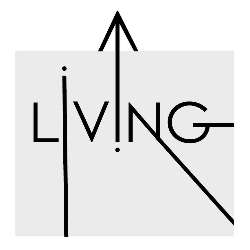
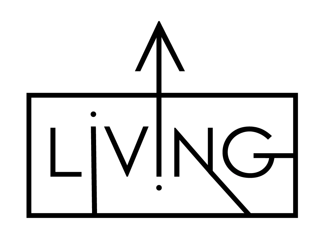
LIVING was a logo created for an event space staged as a modern luxury apartment. After researching possibilities for the name, the client initially decided to work with “Living UP” (the apartment is a top floor penthouse) and finally settled for LIVING. The narrative connections are with the living room set up and a luxury lifestyle / life lived at the top of its potential.
You will see in the final choice for the logo that the “UP” is still hinted by the upward arrow and the dot of the “i” acting as a symbol for the starting point. Additionally, enclosing the text in a rectangle enhances the dynamic effect of the arrow and gives the final result a vague floor plan look.
Annoncious is a consulting company in Portugal and needed a simple corporate logo to use easily on its official documents as well as business cards and website. The final result uses the brand’s initials, a graphic elements that abstracts the Portuguese flag and the full company name.
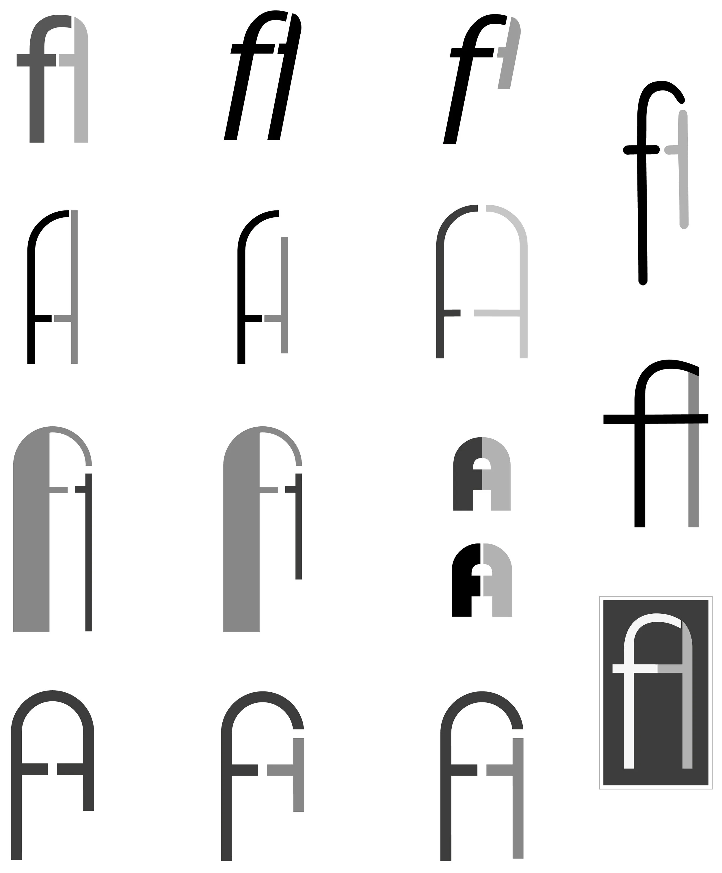
The logo study below is shown in particular detail because it took many forms before coming to a final result. This project was for a private client that needed to establish his personal brand on social media and through personalized stationery. First, we worked on a monogram of his initials. As you will see below, the letters start as clearly separated and slowly start merging more and more into each other until the A & F together look like the A alone at first glance.
Halfway into the development of the monogram, the client decided to change direction and use his glasses as personal branding element. While proposing some variations of fonts and layouts, I’ve also proposed an abstract portrait. The client was ecstatic about it and requested to refresh the haircut and include his initial again rather than his full name. The final result displays them on the glasses’ hinges and removes the square frame to allow a more flexible use of the portrait (ie. in round profile images such as Whatsapp or Instagram).
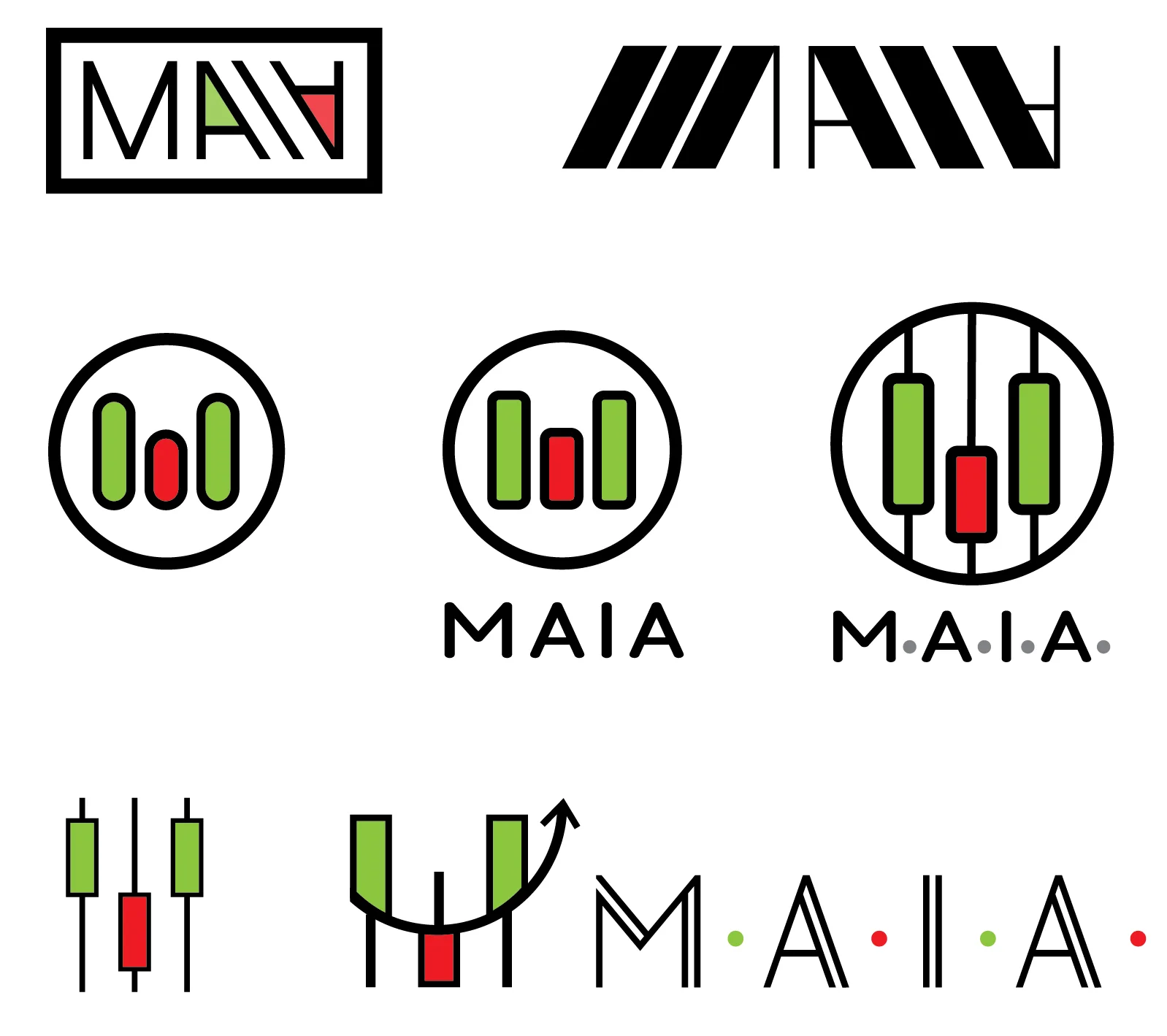
M.A.I.A. or Market Analysis International A… offers trade markets analysis. The client wanted to play with the green and red bars typical of stock charts. The first logos use the ‘A’s as arrows going upwards and downwards, separated by the ‘I’ acting as a slash. The second row uses the bars to make the M, and then includes the typical thinner line for a result that looks more like an abacus (reconnecting data analysis and “counting”).
The client preferred the logo to be even more closely related to the trade graphs, so we created an image resembling an M while using the original squared look of the bars. The full logo also includes the company’s acronym and copyrights.
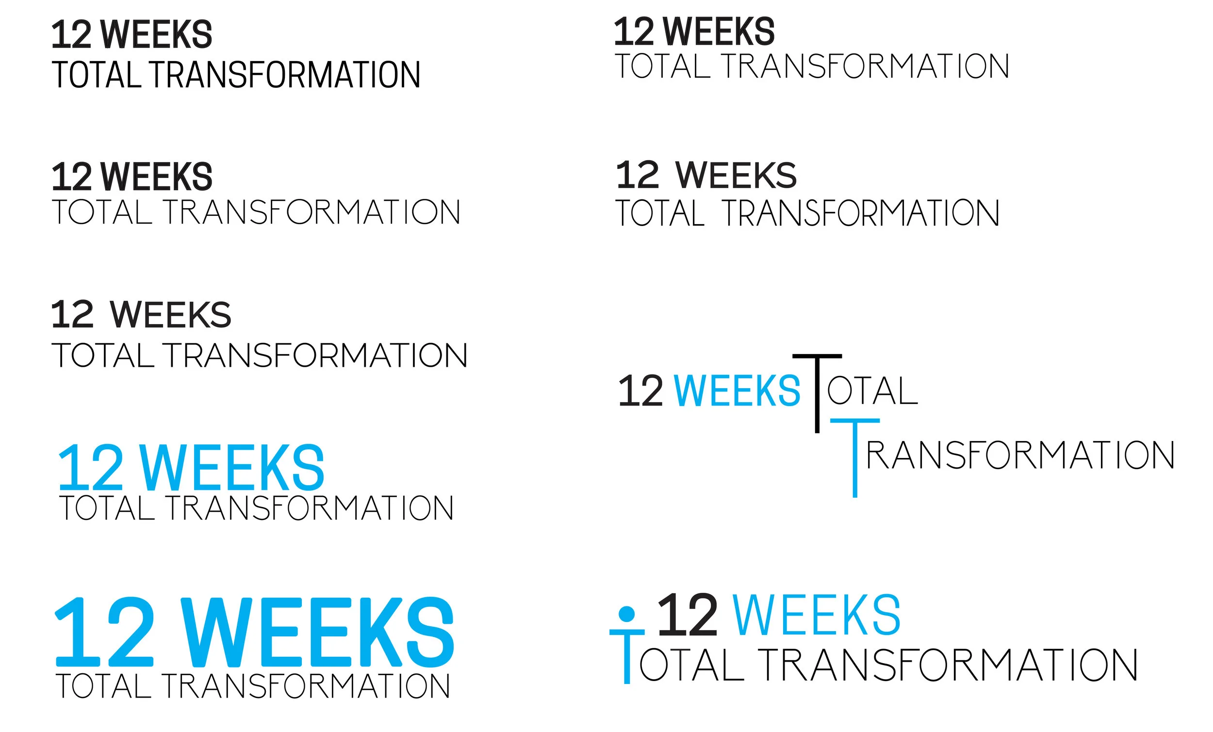
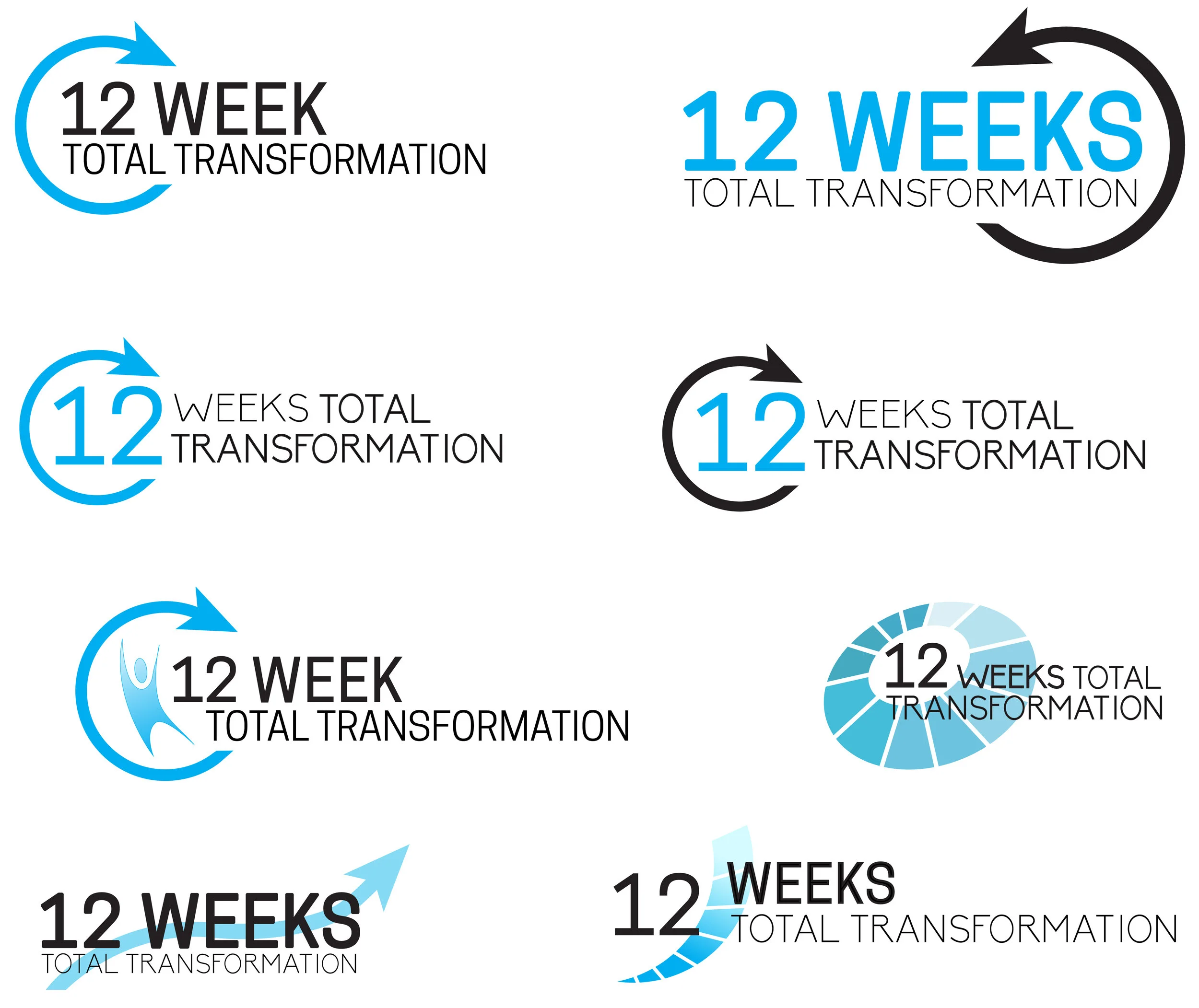
12 Week Total Transformation or 12WTT is a company launched by nutritionists to sell pea-protein based integrators that help people reach their diet goals. The client wasn’t 12WTT directly but an agency working on their marketing strategy and they considered replacing the original logo for a better brand image.
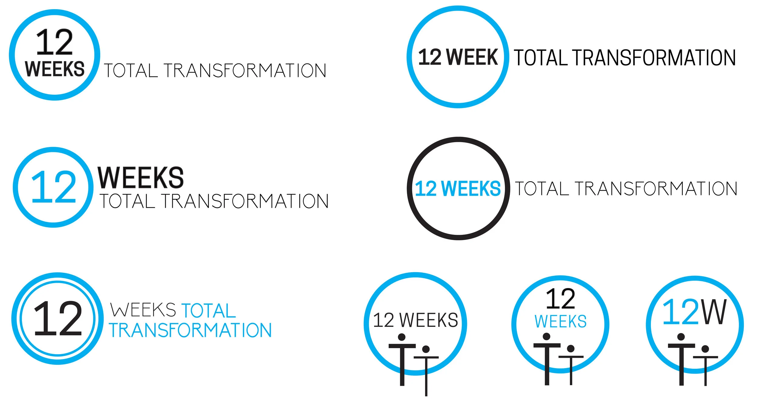
Initially reticent to re-invest and unsure about whether the name should be 12 Week or 12 Weeks, the nutritionists preferred to see a simple text logo with minimal graphics, possibly similar to their current branding. As you will see below, during a second phase we were able to propose more variations.
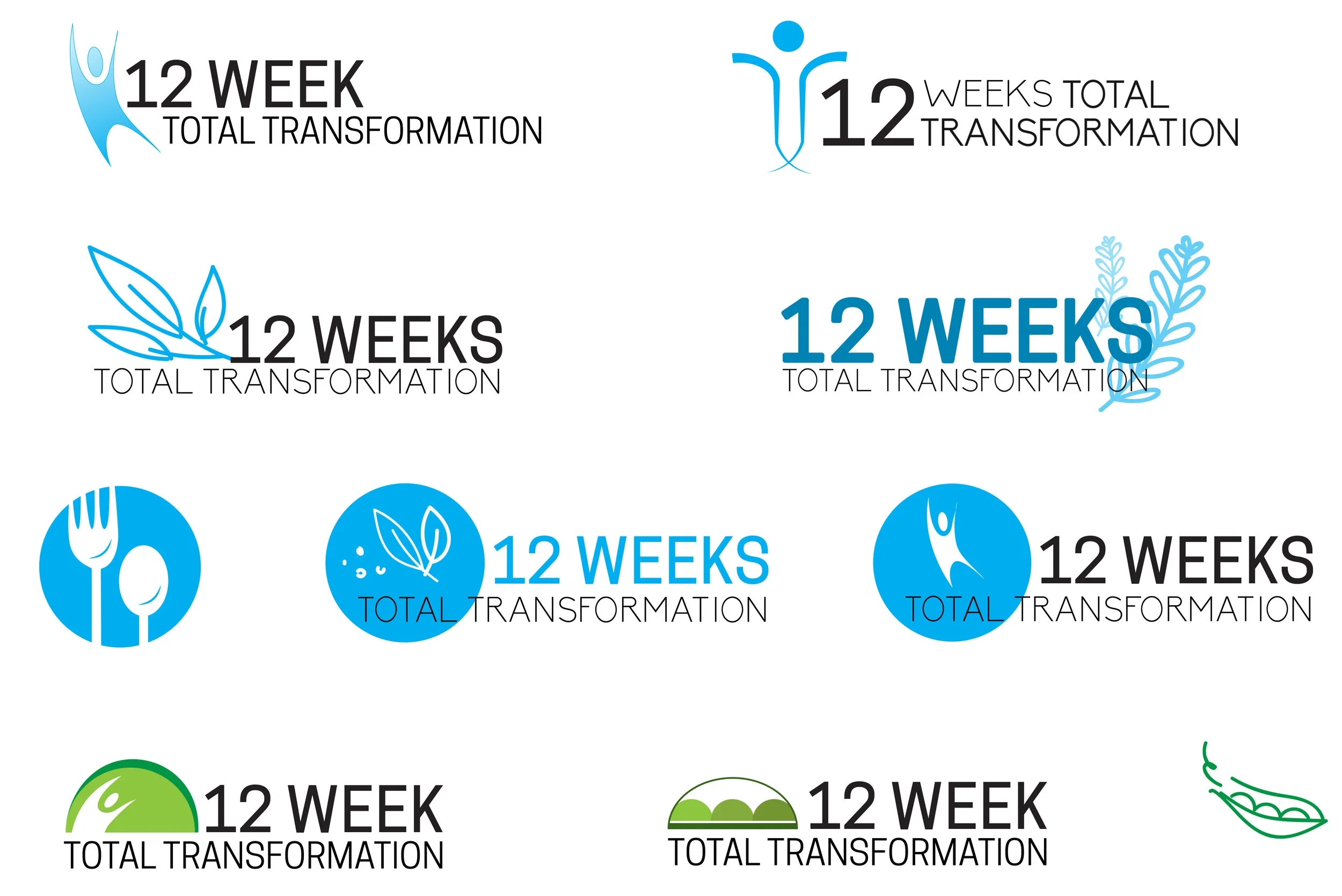
After the first round, the client agreed to play with more graphic elements like: dynamic abstractions of people, leaves from the plants they use as ingredients, the pea - main ingredient in their product line, and designs representing the 12 week progression to a better body and health.
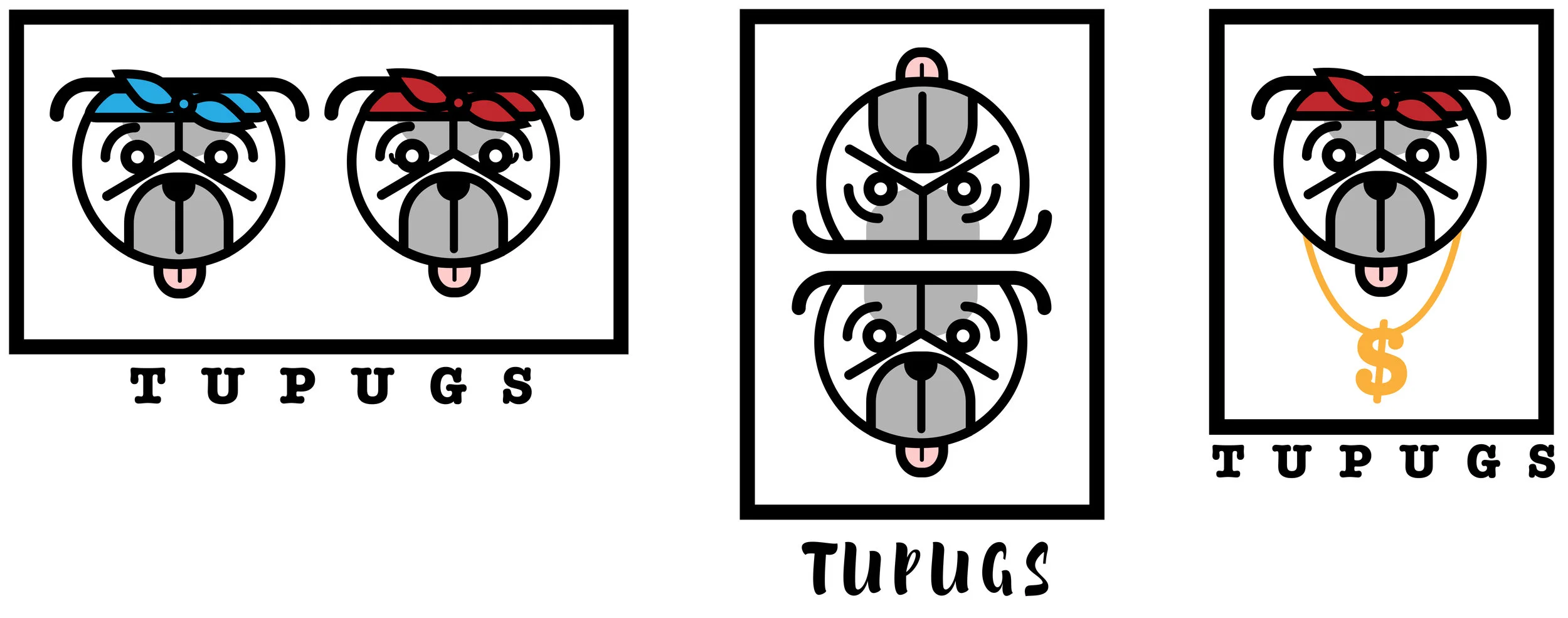
TUPUGS is a company whose name and logo are unrelated to its operations. The name was born from the association of the pug breed, the number two and the alliteration to the name of famous rapper Tupac. The logo puts together those concepts quite literally with two pugs sporting Tupac’s iconic bandana and dollar chain.
The final result only displays one pug after all, but wearing the bandana!
